First the good news: The Clark is back and the collection hasn’t changed. Now the bad news: practically everything else about the new Tadeo Ando re-imagining of the space – extension, entrance, bookstore, café and grounds.
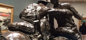
The Clark Art Institute in Williamstown is a beloved fixture of the Berkshires with a core collection of Renoir, Sargent, Homer and Remington that reflect the time and taste of Sterling and Francine Clark as they collected from the 1920s to 50s. In the manner of the very rich at the turn of the century (Clark was the grandson of the lawyer who filed patent infringements on behalf of Isaac Singer whose sewing machine was the engine behind New England’s mills.) Clark represented the classic 19thC American success story – wealth begets wealth which begets largesse to the community in the form of legacies in arts and education.
The expanded Clark opened in July 2014 after 13 years of continual expansion and re-envisioning with an extension by Japanese architect Tadeo Ando. Having just encountered Ando’s work on Naoshima Island in Japan a few months previously, I was very curious to see how Ando’s stark concrete-ism would transfer. Frankly, it doesn’t and I’m sure I’m a minority view on this. I don’t like concrete, especially not in buildings. I don’t like it polished, or striated, or looking like planks of wood. It reminds me of armies and bunkers and geometric calibrations – all sharp right angles in massive slabs.
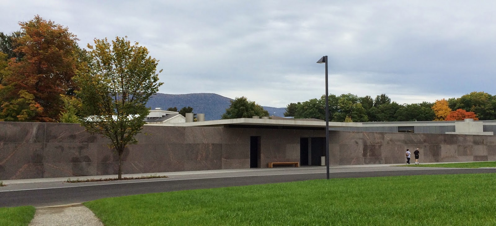
Yes, the expansion is surrounded by light — floor to ceiling windows, reflecting pools and thrusting pillars, but it’s still concrete. Cold, impersonal, refusing to play with any other natural substance. So this sets the tone for the entrance – a long, low- slung slab of polished concrete and granite with no obvious entrance. It looks like a not too important war memorial – or, as my son points out – something that could be the fictitious Worcester Holocaust Museum (a city of no significance with an unnecessary and depressing museum). Not an encouraging start.
After you enter and get past the low slung wall, you are pleasantly greeted by the floor-to-ceiling sweep of windows and views out to the pastures and meadows beyond – if one ignores the expanse of colorless concrete and granite terrace, surrounding the huge reflecting pools with their stone bottoms. Can’t wait for winter when it’s frozen or drained, or just an endless slab of grey wherever you look.
Some of it works. The exhibition hall below ground level designed for large-scale paintings, is terrific. Big and light and airy and very flexible. Here the height of the ceilings and glimpses of soaring granite and pebbled water work to ground the galleries.
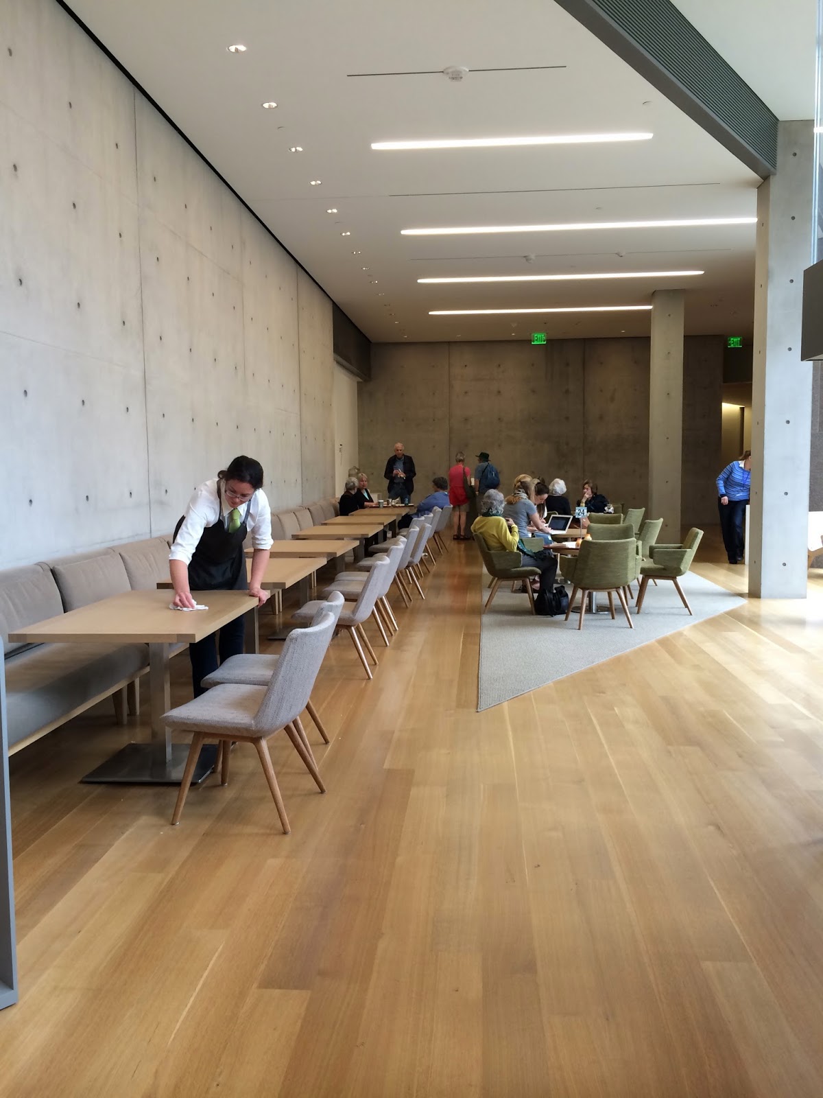
However, just outside the new gallery is the main musuem café in what might be a hallway or an airport lounge with exactly that amount of charm and invitation to linger. I walked through it twice, thinking – this is it? The end is a cul-de-sac with no windows, or natural light with zero curb appeal. I don’t get it. This is the only place to eat in a museum that used to have a sit-down restaurant (like pretty much every museum in the world) and a separate café.
Upstairs, the bookstore/gift shop has about the same stay-away appeal, only with light and views. Books will not be big sellers in this store as they are all tucked away, spine out, on a high shelf that does not invite you to browse, as you might knock over the ceramics alongside.
From the store you have to walk from the new wing to the old, original museum through a long corridor to the new formal entrance. This final connection actually works, with a lovely soaring atrium that does not overwhelm the classic entrance, but invites you to sit and ponder the view to the meadows before attacking the spectacular art within which of course is why you go to The Clarke in the first place.
But after the art all the things I love about museums are missing or not being given attention: The café, a sit-down restaurant with a view, the display cases of jewelry and related items, art books open on tables, the invitation to browse, chairs that are made of familiar materials with texture. Instead here are concrete walls with what look like repeating bullet holes (rebar).
I can’t imagine that purists will allow these massive walls to be stained with art or hung with stuff. I am also not sure why the exact same features that were used in a museum on an island in the Japanese Inland Sea (below) are being re-used in the Berkshires of Western Massachusetts.
Is this the equivalent of being famous and lazy? Or believing your own press? It worked over there, and I got away with it, so I’ll just do it again and again and again? Really? Isn’t that how we ended up with the hideous Boston City Hall – an eyesore that is universally reviled some 46 years after it was oh-so-new in the “brutalist” architectural style. I predict that the pleasures of concrete will go the same way.


